Reference
Contents
Citations and bibliography
You can open the file in BibDesk on macOS, JabRef on Windows, or Zotero or Mendeley online.
You can download a BibTeX file of all the non-web-based readings in the course.
Colors
-
 Adboe Color
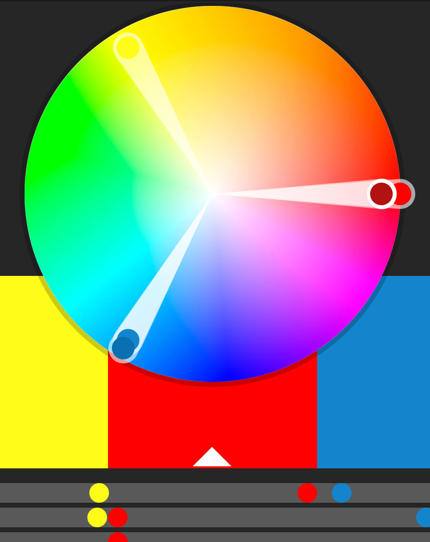
Adobe Color: Create, share, and explore rule-based and custom color palettes. - ColorBrewer: Sequential, diverging, and qualitative color palettes that take accessibility into account.
- Colorgorical: Create color palettes based on fancy mathematical rules for perceptual distance.
- Colorpicker for data: More fancy mathematical rules for color palettes (explanation).
- iWantHue: Yet another perceptual distance-based color palette builder.
- ColourLovers: Like Facebook for color palettes.
- Photochrome: Word-based color pallettes.
- Viridis palettes: R package for viridis palettes.
Fonts
- Google Fonts: Huge collection of free, well-made fonts.
- The Ultimate Collection of Google Font Pairings: A list of great, well-designed font pairings from all those fonts hosted by Google (for when you’re looking for good contrasting or complementary fonts).
Graphic assets
- Stock photos
- Use the Creative Commons filters on Google Images or Flickr
- Pexels
- Pixabay
- Unsplash
- StockSnap.io
- Burst
- freephotos.cc
- Vectors
- Noun Project: Thousands of free simple vector images
- Vecteezy: Thousands of free vector images
- Vectors, photos, videos, and other assets
Accessibility
- Vischeck: Simulate how your images look for people with different forms of colorblindness (web-based)
- Color Oracle: Simulate how your images look for people with different forms of colorblindness (desktop-based, more types of colorblindness)
How to select the appropriate chart type
 The Data Visualisation Catalogue
Many people have created many useful tools for selecting the correct chart type for a given dataset or question. Here are some of the best:
- The Data Visualisation Catalogue: Descriptions, explanations, examples, and tools for creating 60 different types of visualizations.
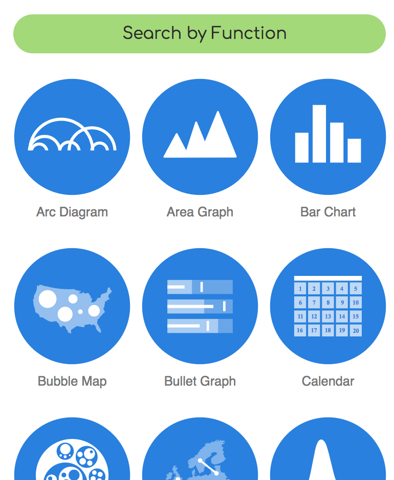
- The Data Viz Project: Descriptions and examples for 150 different types of visualizations. Also allows you to search by data shape and chart function (comparison, correlation, distribution, geographical, part to whole, trend over time, etc.).
- The Chartmaker Directory: examples of how to create 51 different types of visualizations in 31 different software packages, including Excel, Tableau, and R.
- R Graph Catalog: R code for 124 ggplot graphs.
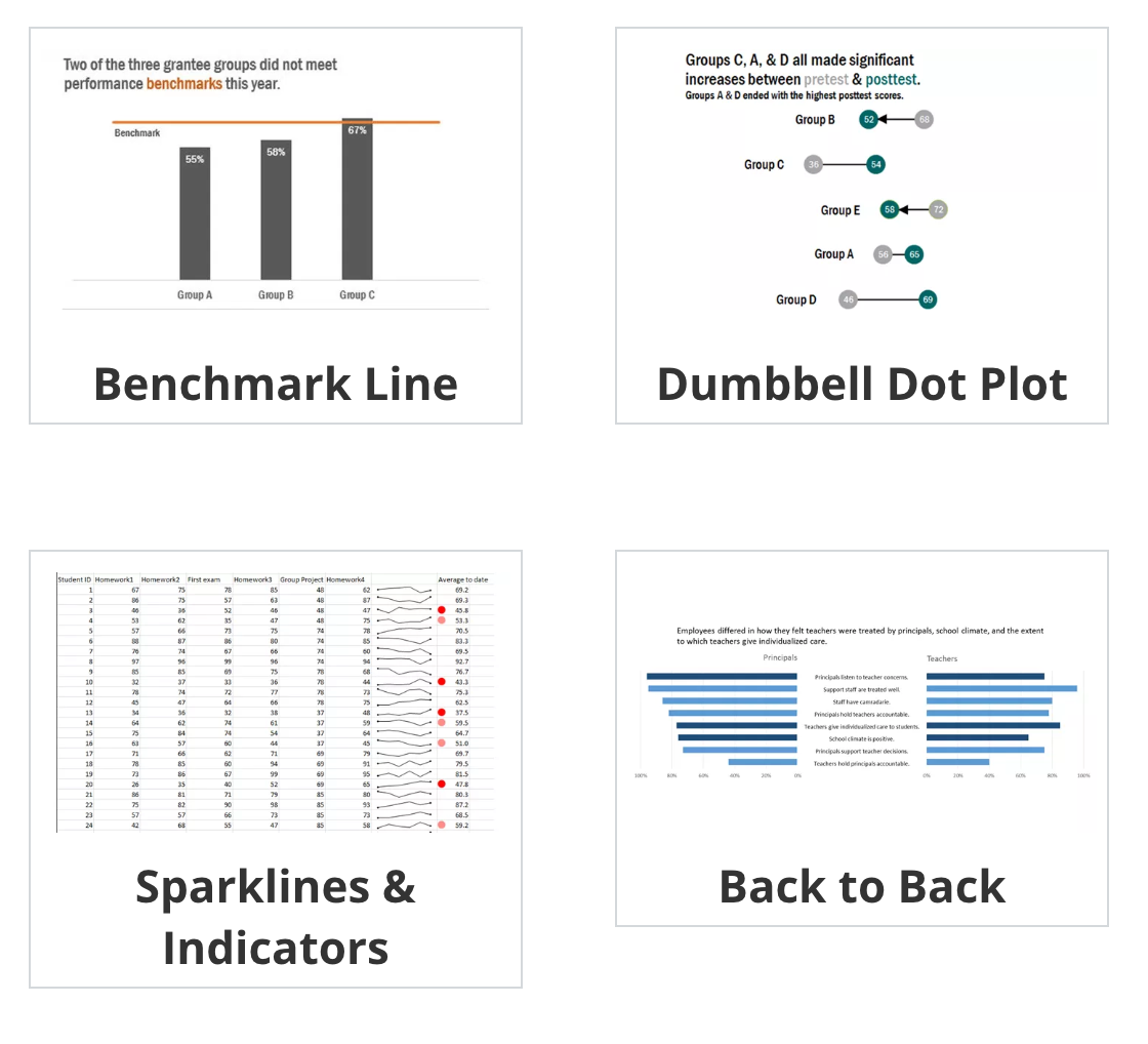
- Emery’s Essentials: Descriptions and examples of 26 different chart types.
Helpful data visualization resources
- Storytelling with Data: Blog and site full of resources by Cole Nussbaumer Knaflic.
- Ann K. Emery’s blog: Blog and tutorials by Ann Emery.
- Evergreen Data: Helful resources by Stephanie Evergreen.
- PolicyViz: Regular podcast and site full of helpful resources by Jon Schwabisch.
- @HelpMeViz: Community of people who give advice on how to visualize data.
- Visualising Data: Fantastic collection of visualization resources, articles, and tutorials by Andy Kirk.
- Info We Trust: Detailed explorations of visualizations by RJ Andrews, including a beautiful visual history of the field.
- FlowingData: Blog by Nathan Yau.
- Information is Beautiful: Blog by David McCandless.
- Junk Charts: Blog by Kaiser Fung.
- WTF Visualizations: Visualizations that make you ask “What the Freak?”🙊 Hi BYU! 🙊
- The Data Visualization Checklist: A helpful set of criteria for grading the effectiveness of a graphic.
- Data Literacy Starter Kit: Compilation of resources to become data literate by Laura Calloway.
- Seeing Data: A series of research projects about perceptions and visualizations.
Visualization in Excel
-
 Stephanie Evergreen’s Excel tutorials
How to Build Data Visualizations in Excel: Detailed tutorials for creating 14 different visualizations in Excel. - Ann Emery’s tutorials: Fantastic series of tutorials for creating charts in Excel.
Visualization in Tableau
Because it is focused entirely on visualization (and because it’s a well-supported commercial product), Tableau has a phenomenal library of tutorials and training videos. There’s a helpful collections of videos here, as well.
Working with R and ggplot2
- Pro-tip: Searching for help with R on Google can be tricky because the program is, um, a single letter. Try searching for “rstats” instead. If you use Twitter, post R-related questions and content with #rstats. The R community on StackOverflow is also incredibly kind and helpful.
Garrett Grolemund and Hadley Wickham, R for Data Science: Fantastic introduction to R and thetidyverse, with some chapters specifically for data visualization. - Kieran Healy, Data Visualization for Social Science: A practical introduction with R and ggplot2: This is a new, still-in-draft book that provides excellent examples and tutorials about how to create graphics with R and ggplot2.
- Stat 545: Dr. Jenny Bryan at the University of British Columbia has an entire introductory course in R, visualization, and data analysis online.
- STA 112FS: Data Science: Dr. Mine Çetinkaya-Rundel at Duke University has an entire introductory course in R, visualization, and data science online.
- CSE 631: Principles & Practice of Data Visualization: Yet another introductory course for R and ggplot2 by Dr. Alison Presmanes Hill at Ohio State University.
- R and RStudio cheat sheets: A large collection of simple cheat sheets for RStudio,
ggplot2, and other R-related things.
R in the wild
A popular (and increasingly standard) way for sharing your analyses and visualizations is to post an annotated explanation of your process somewhere online. RStudio allows you to publish knitted HTML files directly to RPubs, but you can also post your output to a blog or other type of website. If you want to be really fancy, you can use blogdown, which makes a complete website with R Markdown files. That’s actually how this site is built (see the source code). You can build your own site with this tutorial.
Reading these kinds of posts is one of the best ways to learn R, since they walk you through each step of the process and show the code and output.
Here are some of the best examples I’ve come across:
- Text analysis of Trump’s tweets confirms he writes only the (angrier) Android half (with a follow-up)
- Bob Ross - Joy of Painting
- Bechdel analysis using the tidyverse There are a bunch of examples using data from FiveThirtyEight.
- Sexism on the Silver Screen: Exploring film’s gender divide
- Comparison of Quentin Tarantino Movies by Box Office and the Bechdel Test
- Who came to vote in Utah’s caucuses?
- Health care indicators in Utah counties
- Song lyrics across the United States
- A decade (ish) of listening to Sigur Rós
- When is Tom peeping these days? There are a bunch of final projects from other R and data visualization classes here and here.
- Mapping Fall Foliage
- General (Attys) Distributions
- Disproving Approval